Prof. Martin Madsen (Associate Professor of Physics), presented at the 2016 Ides of August on the results of his study of the path that our students take through their four years at Wabash. This was a great example of how “big data” can give us insight into patterns (shown in Martin’s summary figure below, which captures how the paths of our students differ across majors) that we might not easily capture in other kinds of reports.
This project follows work from Preston Bost on the classes that Wabash students take in their first year at the college. I extended the work and looked across all four years. The data set comes from the Institutional Research office and consists of all courses (by department and course number) for students that graduated from Wabash College in the years 2007 – 2016. There are 1887 individual students in this data set.
The courses exclude all-college courses (Freshman Tutorial, Enduring Questions, and Cultures & Traditions), transfer courses, courses awarded as back-credit, or lab sections. All sections of a course (i.e. special topics, or changed course designations) are included under the same course number (for example, if PHY 114 was changed to PHY 112, both courses are included under the number that the students took them). There are a total of 756 different courses listed for a total of 59,408 student-course data points.
The “courseEnrollments.png” data show the fraction of total students that took each of the different courses in the data set. The horizontal axis is organized by department with each column in the department representing a different course number, in ascending (left-to-right) numerical order.
The “majorNumbers.png” data show the fraction of students that majored in each of the different possible majors at the college over this 10 year period. Because the data only include graduated students, every student had a major. Double majors were counted twice in these data. The colors used in this chart represent the different majors and are repeated in the combined data set.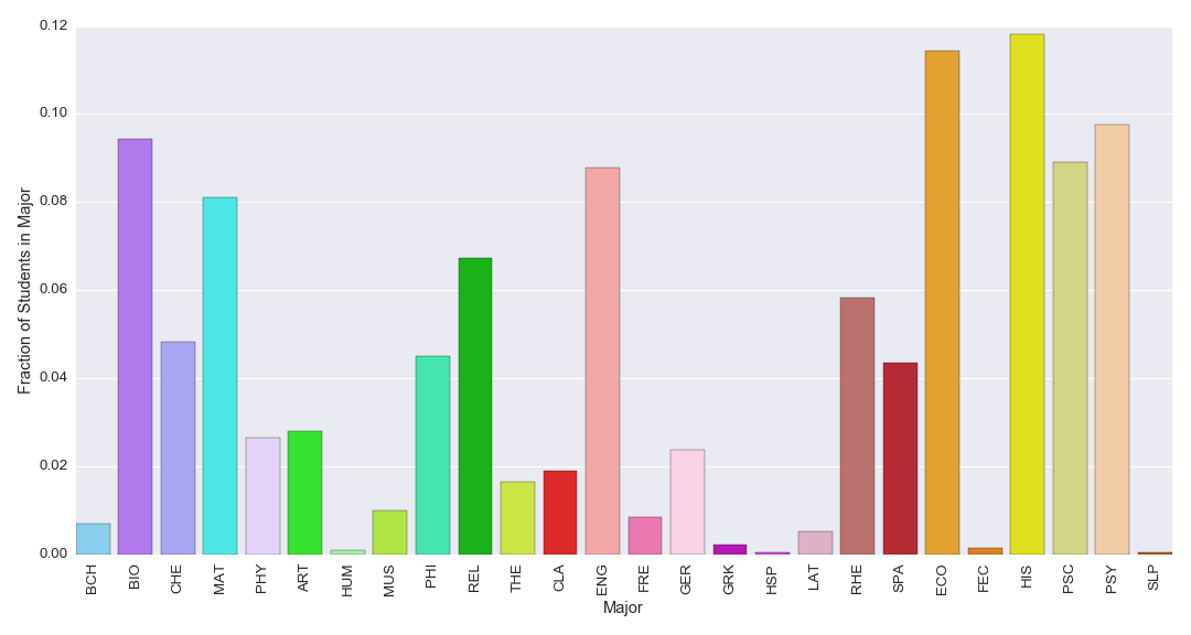
The main figure, “allmajors.png”, shows all the data. The color of each point represents the graduating major. The brightness of each point corresponds to the fraction of each major that took the same class at the same point in their career (i.e. if all physics majors take PHY 111 the fall of their freshman year, that point will be very bright, if only 1/4 of the physics majors take MAT 223 the fall of their freshman year, that point will be much dimmer). The vertical axis represents an increase (from bottom-to-top) of time from the fall of the freshman year to the senior year (plus the fall of year 5 for some students).
*Note: Martin also created a PDF version of the data plot (11 x 17), which should be easier to download!